Queue Simulator, Explained
After reading this you can predict how long a checkout line will make people wait, explain why a system at 95% load feels broken while one at 80% feels fine, and say when one shared queue beats separate lines.
What the simulator does and one hook
Customers arrive at random. Servers take a random time to help each one. You pick the layout: a single shared snake feeding every counter, or one line per till where people join the shortest and may jockey to a faster lane. The screen shows dots queuing, advancing and leaving, and the statistics panel reports the average wait, the 95th-percentile wait and server utilisation, with an M/M/c prediction drawn alongside.
Here is the hook. Take one server that can handle 10 customers per hour. Feed it 8 customers per hour and the average wait is about 24 minutes. Feed it 9.5 customers per hour, only 19% more work, and the average wait jumps to about 114 minutes, almost five times longer. The line did not get 19% worse. It got 375% worse. That nonlinear blow-up near full load is the single most important fact about queues, and the simulator lets you watch it happen.
The vocabulary you need
- Arrival rate \lambda
- Average number of customers arriving per unit time. If \lambda = 8 per hour, one arrives every 7.5 minutes on average.
- Service rate \mu
- Average number a single server finishes per unit time. If \mu = 10 per hour, one service takes 6 minutes on average.
- Number of servers c
- How many tills are open. Total capacity is c\mu.
- Utilisation \rho
- The fraction of capacity in use, \rho = \lambda / (c\mu). A stable queue needs \rho \lt 1.
The label M/M/c is Kendall notation. The first M means arrivals follow a Poisson process (exponential gaps between arrivals). The second M means service times are exponential. The c is the server count. Swap the second letter to D for deterministic (every service takes exactly the same time) or use the general G for anything else.
When the model fits and when it does not
The M/M/c model fits well when arrivals are genuinely independent and unscheduled: walk-in customers, web requests, calls to a help line. It fits badly when arrivals are booked (a dentist with appointments), when demand surges on a schedule (lunch rush), or when customers give up and leave. It also assumes servers never tire and never take breaks.
The formulas below are steady-state averages. They describe a system left running long enough to settle. A shop that opens at 9am and closes at 5pm may never reach steady state during a busy hour, which is exactly why real queues sometimes behave worse than the equation predicts.
Use the simulator to build intuition and to stress-test a design, not to promise an exact wait time to a real customer. For related agent-based traffic ideas, see the Traffic Jam Simulator and the Zipper Merge Simulator, which show the same load-versus-flow tension on a road.
The formula and why waiting explodes
For a single server (M/M/1) the average time a customer spends waiting in line, before service starts, has a clean form.
Here W_q is the mean wait in the queue, \rho is utilisation and \mu is the service rate. The dangerous term is 1-\rho in the denominator. As \rho climbs toward 1, that term shrinks toward 0, and dividing by a tiny number sends the wait to infinity. The wait scales like \rho/(1-\rho): at \rho = 0.8 that ratio is 4, at \rho = 0.95 it is 19. That is the roughly fivefold jump from the hook.
Variability matters just as much as load. The Pollaczek-Khinchine formula for a single server with general service times shows why:
The new factor is C_s^2, the squared coefficient of variation of service time (variance divided by mean squared). For exponential service C_s^2 = 1, so the middle factor is 1 and you recover the M/M/1 result. For deterministic service the variance is 0, so C_s^2 = 0 and the middle factor is 0.5. Same load, exactly half the wait. That is why a checkout scanning identical items behaves better than one where some baskets take 30 seconds and some take 10 minutes.
A worked example with the demo defaults
The demo button starts with an arrival rate of 8 per hour, a single server finishing 10 per hour, and exponential service. Reproduce these numbers by clicking it.
M/M/1 at 80% load
- Compute utilisation: \rho = \lambda/(c\mu) = 8/(1 \times 10) = 0.8. The server is busy 80% of the time.
- Compute the mean queue wait: W_q = \rho/(\mu(1-\rho)) = 0.8/(10 \times 0.2) = 0.8/2 = 0.4 hours, which is 24 minutes.
- Add the service time to get the total time in system: W = W_q + 1/\mu = 0.4 + 0.1 = 0.5 hours, or 30 minutes.
- Estimate the 95th-percentile wait. For M/M/1 the waiting time has an exponential-like tail; the 95th percentile is roughly 3 times the mean, so expect about 72 minutes. The simulator measures this directly from the dots, so it will wobble around that figure.
Now open a second till (c = 2). Utilisation halves to 0.4, and the M/M/2 mean wait drops to about 2.2 minutes, more than a tenfold improvement from doubling capacity. That is the payoff of moving off the steep part of the curve.
Reading the live statistics
Three numbers carry most of the meaning. Utilisation tells you where you sit on the hockey stick. The average wait is what the equation predicts. The 95th-percentile wait is what customers actually complain about, because a fifth of them wait even longer than that.
| Arrival rate | Utilisation | Mean wait (min) | 95th pct (min) |
|---|---|---|---|
| 5.0 | 0.500 | 6.0 | 18.0 |
| 7.0 | 0.700 | 14.0 | 42.0 |
| 8.0 | 0.800 | 24.0 | 72.0 |
| 9.0 | 0.900 | 54.0 | 162.0 |
| 9.5 | 0.950 | 114.0 | 342.0 |
The inset chart in the tool plots average wait against utilisation as you experiment, tracing this same hockey stick from your own runs. When your measured points sit above the theory line, suspect extra variability (a heavy-tailed service time) or a system that has not settled yet.
One line or many, and jockeying
Switch the layout and watch the difference. A single shared snake feeding all servers is an M/M/c system. Separate lines, one per till, are really c independent M/M/1 systems, and they waste capacity: a server can sit idle behind an empty lane while a customer stews in the next line over.
With two servers at total load \rho = 0.8, the shared M/M/2 queue has a mean wait near 17 minutes, while two split M/M/1 lines (each at 0.8) sit at 24 minutes. Jockeying to the shortest line claws back part of that gap, which is why banks with visible tills feel smoother than toll plazas where you commit to a lane early.
Jockeying works because it partly rebuilds the shared queue: a customer who can see and switch to an idle server stops that server from wasting time. It never fully matches the single snake, because switching has friction and information is imperfect, but it recovers most of the loss.
Common mistakes
Do not read the average wait as the typical experience. At 80% load the mean is 24 minutes but the 95th percentile is 72 minutes. Waiting time is skewed, so more than half of customers wait less than the mean while a painful tail waits far longer. Plan staffing against the percentile, not the average.
Three other traps. First, running with \rho \ge 1: the queue never stabilises and the average wait is not a fixed number, it grows without bound, so the theory line is meaningless there. Second, forgetting that capacity is c\mu, not \mu: doubling servers doubles throughput. Third, ignoring variability: two systems at identical 80% load can differ twofold in wait purely because one has steady service and the other has erratic service.
Related simulators
If load-versus-flow curves interest you, the road models are close cousins: the City Traffic Grid shows gridlock forming as intersections saturate, and Braess's Paradox shows adding capacity backfiring. The Airplane Boarding Simulator is a queueing problem in disguise, and the Bullwhip Effect shows how small demand bumps amplify down a supply chain. For other stochastic dynamics, try the SIR Epidemic Simulator and the Predator-Prey Simulator.
Frequently asked questions
Why does a queue at 95% load feel so much worse than 80%?
Because wait scales like \rho/(1-\rho). At 0.8 that is 4, at 0.95 it is 19, so the mean wait roughly quintuples for a mere 19% increase in demand. The denominator 1-\rho is what makes the curve turn vertical.
Is one shared line really faster than several lines?
For the same total capacity, yes. No server idles while any customer waits, so utilisation is spread evenly. At two servers and 80% load the shared queue waits about 17 minutes versus 24 for split lines.
Why does deterministic service beat exponential service?
The Pollaczek-Khinchine formula puts the factor (1+C_s^2)/2 in front of the wait. Deterministic service has C_s^2 = 0 so the factor is 0.5, exactly half the exponential case where C_s^2 = 1. Predictable service times remove the variance that clogs the line.
What happens if arrivals exceed capacity?
The queue is unstable. With \rho \ge 1 the line grows forever in the long run, so there is no steady-state average wait. In a real shop with a closing time you get a large but finite backlog instead.
Does the simulation match the theory exactly?
Over a long run the measured average should track the M/M/c line closely. Short runs bounce around because of randomness, and any non-exponential service or unsettled start will pull the points off the curve. That gap between simulation and formula is worth watching, not smoothing away.
Related tools

Gerrymandering Sandbox
Draw the districts yourself and watch the same voters produce opposite election results.
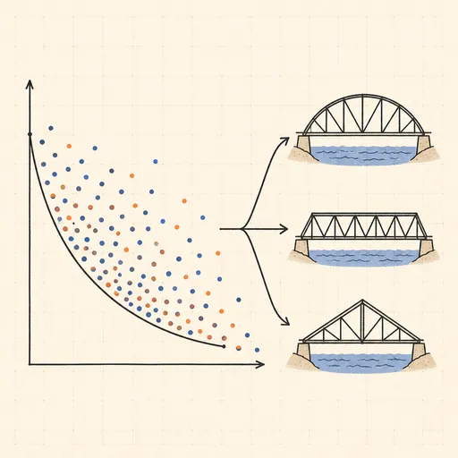
Pareto Frontier Evolution
Watch a genetic algorithm breed bridge designs and trace out the weight-vs-stiffness Pareto frontier, generation by generation.
SIR Epidemic Simulator
Watch an epidemic spread and burn out with the classic susceptible–infected–recovered model.

Sailing & Tacking Simulator
Sail a boat against the wind — trim to the polar diagram, ride the shifts and race the optimal route.
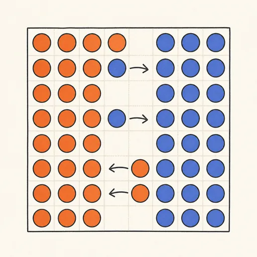
Schelling’s Segregation Model
Give agents a mild preference for similar neighbours and watch a mixed city sort itself into stark blocks.
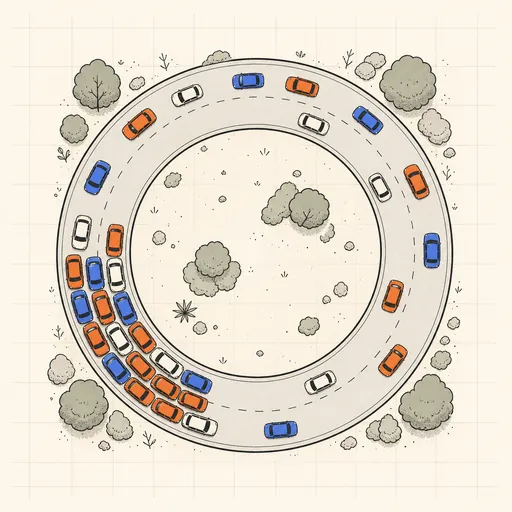
Traffic Jam Simulator
See phantom traffic jams appear from nothing on a ring road with the Nagel–Schreckenberg model.