How Function Sketch Finder Fits a Curve to Your Drawing
After reading this you will know how a hand-drawn curve becomes weighted data points, how two solvers fit about 25 function families to those points, and how the ranking score decides which equation wins.
What the tool does
You draw a shape you have in mind: a rising line, a hump, an S-curve, a wobble that decays. The tool converts your strokes into points, fits many candidate equations to those points, and hands back a ranked list of formulas with their errors and a plot. You are not fitting one model. You are running a small competition among polynomials, roots, logarithms, exponentials, sines, Gaussians, logistic curves and more, then comparing the winners on equal terms.
Here is the hook. Sketch a single smooth bump that rises from near zero, peaks, and falls back toward zero. A sixth-degree polynomial can trace that bump almost exactly, but so can a Gaussian bell a \cdot e^{-(x-b)^2 / (2c^2)} using three numbers instead of seven. The tool is built to prefer the Gaussian, because a simpler equation that fits nearly as well is usually the better description. The rest of this article explains exactly how that preference is enforced with numbers you can check.
When to use it, and when not to
Reach for this tool when you have a shape and want a formula. Maybe you remember the rough graph of a measurement but not its equation. Maybe you want to know whether your data looks more like exponential growth or a power law. Maybe you are teaching function families and want to see how each one bends. The tool answers the question "what equation makes this curve?" quickly and locally.
Do not use it as a general regression system for real datasets with many input variables. Every fit here is a function of a single input x producing a single output y. There is no train/test split, no cross-validation, and no noise model beyond the least-squares assumption. A good R^2 on your sketch says the equation traces your drawing, not that it will predict anything.
A high R^2 against a hand sketch is not evidence about the world. Your sketch is the target, not a sample from a real process. Treat the output as "this equation reproduces the shape I drew," nothing more.
From strokes to weighted points
Before any fitting happens, the tool resamples your drawing into a set of points (x_i, y_i). Freehand strokes, line segments, and arcs are all cut into evenly spaced samples along their length. Points you type or click as exact coordinates are kept as-is and given four times the weight of a freehand sample, because you meant those precisely.
Weighting matters for every fit. Each point carries a weight w_i, and the tool minimizes weighted squared error rather than plain squared error:
Here n is the number of resampled points, y_i is the height you drew at x_i, and f(x_i) is the candidate function's value there. A placed point with w_i = 4 pulls the fit toward itself four times as hard as a freehand point with w_i = 1. If your drawing must pass through a specific spot, place a point there.
Two solvers, one for each kind of family
The families split into two groups by how the unknown parameters enter the equation.
Linear-in-parameters families are ones where the output is a weighted sum of fixed functions of x. Every polynomial is like this. A cubic a_0 + a_1 x + a_2 x^2 + a_3 x^3 is linear in a_0, a_1, a_2, a_3 even though it is curved in x. For these, weighted least squares gives the exact best coefficients in one step by solving the normal equations:
where X holds the basis functions evaluated at each point, W is the diagonal matrix of weights, y is the vector of drawn heights, and \hat{\beta} is the vector of best-fit coefficients. No iteration, no starting guess.
Nonlinear families hide a parameter inside a function. In a \cdot e^{b x} the rate b sits in the exponent, and in a \sin(b x + c) the frequency b sits inside the sine. There is no closed-form solution, so the tool uses Levenberg-Marquardt, an iterative method that starts from a guess and steps toward lower error, blending Gauss-Newton steps with gradient-descent steps depending on how well each step goes. The starting guesses are data-driven: candidate sine frequencies come from a grid across your sketch width, exponential rates come from the vertical range. A poor start can settle in a local minimum, which is why redrawing at a different scale sometimes changes the result.
If a sine or exponential fit looks wrong, it may be stuck in a local minimum. Zoom out, redraw the same shape wider or taller, and run the search again. The starting guesses scale with your sketch, so a different scale gives the iteration a different launch point.
The ranking score: closeness versus simplicity
Once every family has its best fit, they must be compared. A more flexible family will always fit at least as well, so raw error would always crown the sixth-degree polynomial. The tool ranks by a Bayesian information criterion instead:
Here n is the point count, \text{MSE} is the mean squared error of the fit, k is the number of parameters in the family, and \lambda is the simplicity bias you control. The first term rewards a smaller error: halving the MSE lowers the score by n \ln 2 \approx 0.693\,n. The second term charges each parameter a fixed price of \lambda \ln(n). Lower scores win. A family with more parameters must cut the error enough to beat that price, or it loses.
Work the penalty for n = 100 points and \lambda = 1: each parameter costs \ln(100) \approx 4.605. A cubic (k = 4) pays 18.42. A sixth-degree polynomial (k = 7) pays 32.24. Those extra three parameters must drop n \ln(\text{MSE}) by at least 32.24 - 18.42 = 13.82, which means the MSE must fall by a factor of e^{13.82 / 100} \approx 1.148, roughly a 13% reduction, just to break even. Raise the simplicity slider and the price per parameter climbs, so clean low-parameter fits pull ahead.
Worked example: bump versus polynomial on a sketched bump
Sketch a single smooth bump. Suppose it resamples to n = 100 points along a Gaussian-shaped hump. Compare two fits: a Gaussian bell with k = 4 and a sixth-degree polynomial with k = 7.
- The Gaussian fits the hump closely: say \text{MSE} = 0.0020. Then n \ln(\text{MSE}) = 100 \times \ln(0.0020) = 100 \times (-6.215) = -621.5.
- Its parameter penalty at \lambda = 1 is 4 \times \ln(100) = 4 \times 4.605 = 18.42. Gaussian score: -621.5 + 18.42 = -603.1.
- The degree-six polynomial fits slightly better, \text{MSE} = 0.0018, so 100 \times \ln(0.0018) = -631.6.
- Its penalty is 7 \times 4.605 = 32.24. Polynomial score: -631.6 + 32.24 = -599.4.
- The Gaussian score
-603.1is lower than the polynomial score-599.4, so the Gaussian wins by3.7even though the polynomial had the smaller error.
The polynomial shaved the error but not enough to pay for four extra parameters. That is the whole point of the score.
Reading the results
Each row reports an equation, an R^2, an RMSE, and a thumbnail. Read them together.
- R squared
- The fraction of variance in your drawn heights explained by the fit, R^2 = 1 - \text{SSE} / \text{SST}. A value of
0.99means the fit reproduces 99% of the up-and-down variation in your sketch. It rises as you add parameters, so never rank on R^2 alone. - RMSE
- Root mean squared error, in the same units as your
yaxis. An RMSE of0.045means the fitted curve sits about 0.045 units away from your sketch on a typical point. Unlike R^2, this is a direct distance you can picture on the grid. - Score
- The BIC value above. This is what the ranking uses. Two fits with equal R^2 are separated by parameter count through this score.
Click any row to overlay its curve on your sketch. Trust the overlay over the numbers: if the top-ranked equation visibly misses a feature you care about, look further down the list for a family that catches it, even at a slightly worse score.
Common mistakes
Chasing R squared. The sixth-degree polynomial almost always has the highest R^2 and is almost never the best description. That is exactly why the tool ranks on the BIC score, not on R^2. If you sort by fit closeness you will keep picking wobbly high-degree polynomials. The Overfitting Sandbox shows the same trap on noisy data: degree climbs, training error falls, and the curve stops meaning anything.
Sketching too few features. A family is only chosen if your drawing shows the feature that distinguishes it. A logistic S-curve and a hyperbolic tangent both flatten at both ends; if you draw only the rising middle, several families will tie and the winner is close to arbitrary. Draw the flat tails so the fit has something to lock onto.
Ignoring the local-minimum warning for nonlinear fits. A sine fit that reports a strange frequency has probably converged to the wrong period. Redraw wider and rerun.
Reading prediction into a shape match. The fit describes the curve you drew. It carries no claim about data you did not draw.
Related tools on this site
The single-step weighted least squares behind the polynomial fits is the same machinery, seen live, in the Linear Regression Playground, where you can watch the least-squares line settle as you move points. For the same fitting idea applied to stacking simple curves on residuals, the Gradient Boosting Step-by-Step tool builds a 1D regression curve stage by stage and then, tellingly, overfits it.
Frequently asked questions
Why did a simple function beat one with a better fit?
The ranking uses n \ln(\text{MSE}) + \lambda k \ln(n), which charges each parameter a price. The better-fitting model won on error but lost on that price. In the worked example the Gaussian scored -603.1 against the polynomial's -599.4 despite a larger MSE, because three extra parameters cost more than they saved.
What does the simplicity slider actually change?
It scales \lambda in the score. At \lambda = 0 parameters are free and the highest-degree polynomial usually wins. Higher \lambda raises the per-parameter price (\lambda \ln n each), pushing clean, low-parameter families to the top.
Why do my placed points matter more than freehand strokes?
Placed points get weight w_i = 4 versus w_i = 1 for freehand samples, and the fit minimizes weighted squared error. A placed point pulls the curve four times as hard, so use them to pin down exact heights.
Why did the same sketch give a different sine fit after I redrew it?
Nonlinear fits start from data-driven guesses and can settle in a local minimum. The sine's candidate frequencies come from a grid across the sketch width, so drawing wider or narrower feeds the solver a different starting point and can find a better minimum.
Can I trust a 0.99 R squared as proof my equation is right?
No. It means the equation reproduces 99% of the variation in the curve you drew, nothing about unseen data. The sketch is the target, not a sample. Judge the result by whether the overlay matches the features you meant to draw.
Related tools
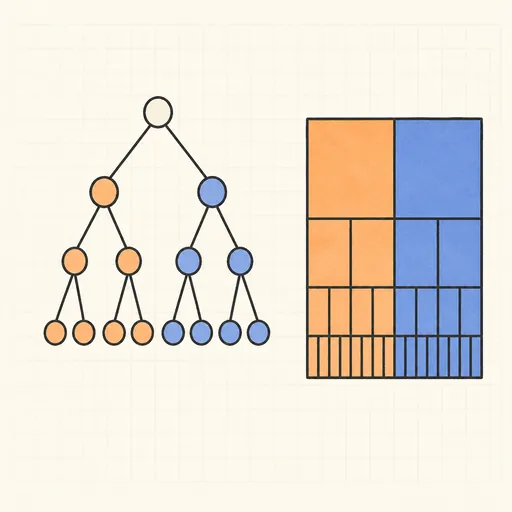
Decision Tree Builder
Grow a CART decision tree split by split and watch the partition map and tree diagram build together.
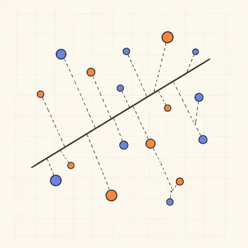
Linear Regression Playground
Place points, watch the least-squares line follow, and see gradient descent crawl across the loss surface.
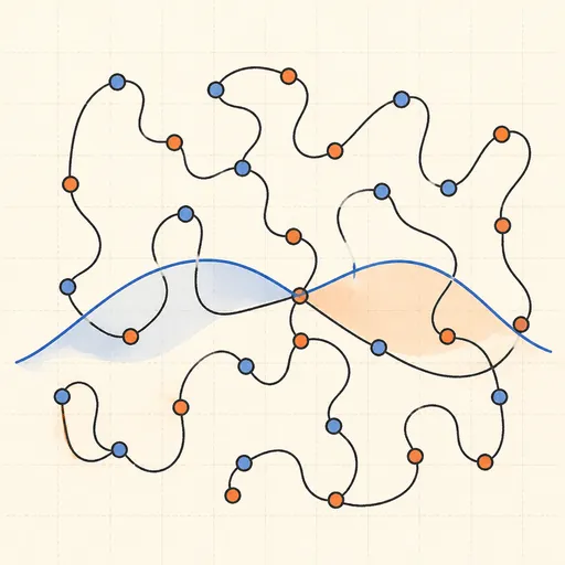
Overfitting Sandbox
Crank a polynomial’s degree on noisy data and watch the train/test error curves split apart.
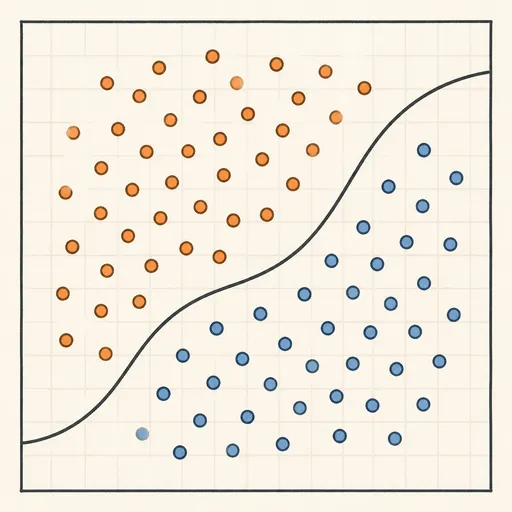
Logistic Regression Playground
Paint two classes of points and watch logistic regression carve out its probability boundary by gradient descent.

Naive Bayes Classifier Demo
Score your own message with a word-count spam filter, or watch Gaussian naive Bayes classify 2D points.
Perceptron Learning Animation
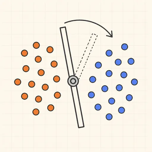
Step through Rosenblatt’s 1958 learning rule and watch the decision boundary rotate with every mistake.