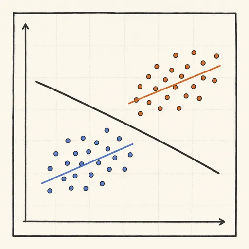
Simpson’s Paradox Visualizer
Simpson’s paradox is when a trend that holds inside every subgroup flips once the groups are combined. This visualizer plots two coloured groups, each with its own upward regression line, while the pooled regression line runs downward. Drag the separation between the groups and their sizes and watch the overall slope reverse sign even though nothing about the within-group relationships changes — a lurking variable (which group a point belongs to) is driving the illusion.
Runs 100% in your browser — simulations are computed locally on your device.
Read the full guide to this tool
Notes
- Each subgroup can show a positive relationship while the combined data shows a negative one, purely from how the groups are placed.
- The reversal comes from a confounding variable — group membership — correlated with both axes.
- The fix is to analyse within groups, or model the confounder, rather than trusting the pooled trend.
- Runs 100% in your browser — simulations are computed locally on your device.
Related tools
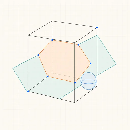
3D Geometry Board
Points, lines, planes, spheres and polyhedra on an orbiting camera — slice solids with planes, unfold nets, drop the Dandelin spheres into a cone and drag everything.
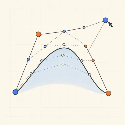
Bézier Curve Playground
Drag control points and watch De Casteljau’s algorithm construct a Bézier curve step by step.
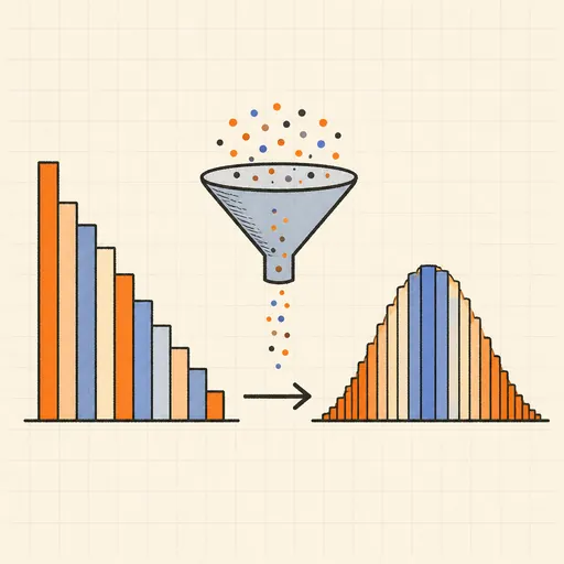
Central Limit Theorem Demo
Sample from any lopsided distribution and watch the averages pile up into a bell curve.
Conway’s Game of Life
Paint cells and watch Conway’s cellular automaton breed gliders, guns and oscillators.
Dynamic Geometry Board
Construct with points, lines, circles and transformations, then drag anything — the construction stays true, and a checker tells you which relations are theorems.

Fantasy Map Generator
Roll a seed and get a continent: coastlines, mountains, rivers, biomes and named towns, ready for your campaign.