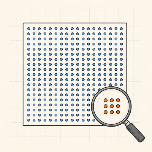
Base Rate Visualizer
A test that is 99% accurate sounds like a 99% verdict — but if the condition is rare, most positive results are false alarms. This visualizer makes that concrete with a population of 1000 dots. Set the prevalence on a log slider (from 1 in 1000 to 1 in 2), the test’s sensitivity and its specificity, then test everyone: dots recolour into true positives, false positives, true negatives and false negatives, and the headline readout gives P(sick | positive) the way humans actually understand it — “of the N people who test positive, only k are sick.” A natural-frequency tree diagram traces the population through sick/healthy branches and test outcomes, and presets jump to the classic cases: rare-disease screening, a common condition, and airport security screening.
Runs 100% in your browser — simulations are computed locally on your device.
Read the full guide to this tool
Notes
- Bayes’ theorem in count form: P(sick | positive) = true positives ÷ (true positives + false positives). When the condition is rare, the healthy majority generates so many false positives that they swamp the true ones.
- Sensitivity and specificity describe the test; the base rate describes the population. Ignoring the base rate and reading test accuracy as your personal probability is the base rate fallacy — most doctors asked this question get it wrong.
- Natural frequencies (“10 of every 1000 people…”) fix the intuition: studies by Gigerenzer show people who fail the percentage version answer correctly when the same problem is posed in counts.
- The same arithmetic dooms mass screening for rare events: an airport scanner that is 99% accurate on a one-in-a-million threat flags roughly ten thousand innocent travellers per true hit.
- Runs 100% in your browser — simulations are computed locally on your device.
Related tools
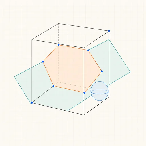
3D Geometry Board
Points, lines, planes, spheres and polyhedra on an orbiting camera — slice solids with planes, unfold nets, drop the Dandelin spheres into a cone and drag everything.
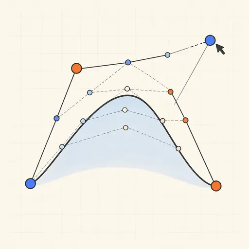
Bézier Curve Playground
Drag control points and watch De Casteljau’s algorithm construct a Bézier curve step by step.
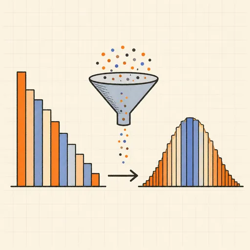
Central Limit Theorem Demo
Sample from any lopsided distribution and watch the averages pile up into a bell curve.
Conway’s Game of Life
Paint cells and watch Conway’s cellular automaton breed gliders, guns and oscillators.
Dynamic Geometry Board
Construct with points, lines, circles and transformations, then drag anything — the construction stays true, and a checker tells you which relations are theorems.

Fantasy Map Generator
Roll a seed and get a continent: coastlines, mountains, rivers, biomes and named towns, ready for your campaign.