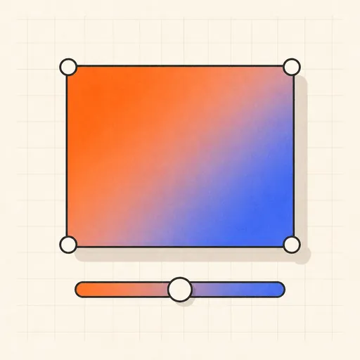
CSS Gradient, Shadow & Radius Generator
Builds CSS visually: linear, radial and conic gradients with draggable color stops; layered box-shadows with per-layer inset; per-corner border radii including the elliptical slash form for organic blobs; plus text-shadow and filter on the same page. Start from a preset (soft card, neon edge, pill, glass), tweak live, then copy the CSS — or export everything as reusable CSS variables.
Runs 100% in your browser — nothing you paste leaves your device.
Read the full guide to this tool
Notes
- The generated CSS uses plain, unprefixed syntax that every current browser understands.
- Soft, realistic shadows come from layering several shadows with increasing blur and decreasing opacity, not from one big blur.
- The slash form "60% 40% 30% 70% / 60% 30% 70% 40%" sets horizontal and vertical radii separately per corner — that asymmetry is what makes blob shapes.
- Runs 100% in your browser — nothing you paste leaves your device.
Explore the idea
Related tools
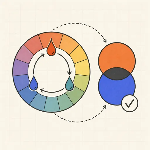
Color Converter & Contrast Checker
HEX ↔ RGB ↔ HSL ↔ OKLCH, plus WCAG contrast ratios.

URL Parser & Query Editor
Split a URL into parts and edit query parameters in a table.

curl Converter
Turn a curl command into fetch, axios, Python or PowerShell.
HTTP Status Codes
Search by code, phrase, or symptom — with retry/cache badges, causes, fixes, and RFC links.

Keycode Inspector
Press any key, see event.key, event.code and modifiers.

User-Agent Parser
Decode any user-agent string: browser, engine, OS, device.